Mobile Plan Comparison Table Redesign
I redesigned the mobile comparison table and developed a fully functional prototype for user testing.
Client:
AT&T Business Digital Experience
My Role:
Product Designer
Year:
2023
THE PROBLEM
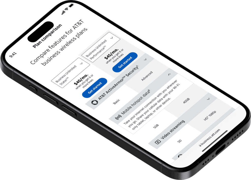
PREVIOUS DESIGN
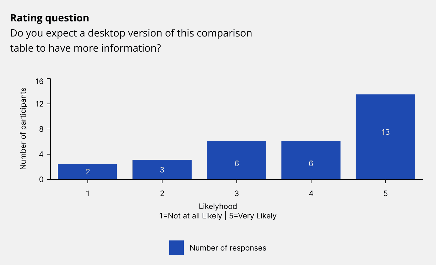
RESEARCH
The CX Team at AT&T conducted user testing on the current design of the comparison table. Based on the research, I identified the friction points users encountered and critical findings.
Moreover, I conducted competitor research and studied the best practices for comparison tables on mobile devices with the help of the Neilson Norman Group website.
Findings
Users want to be able to research what is most important to them. They want to control the experience.
Users expect a truncated mobile view.
Best Practices (via NN/g)
It's impossible to show the user everything at once.
Only offer the tools essential to completing the task.
Allow users to hide what is irrelevant to them.
Allow users to select which two items they want to compare.
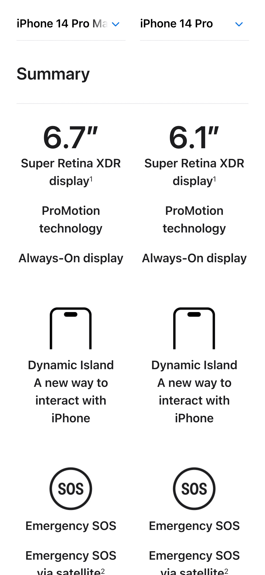
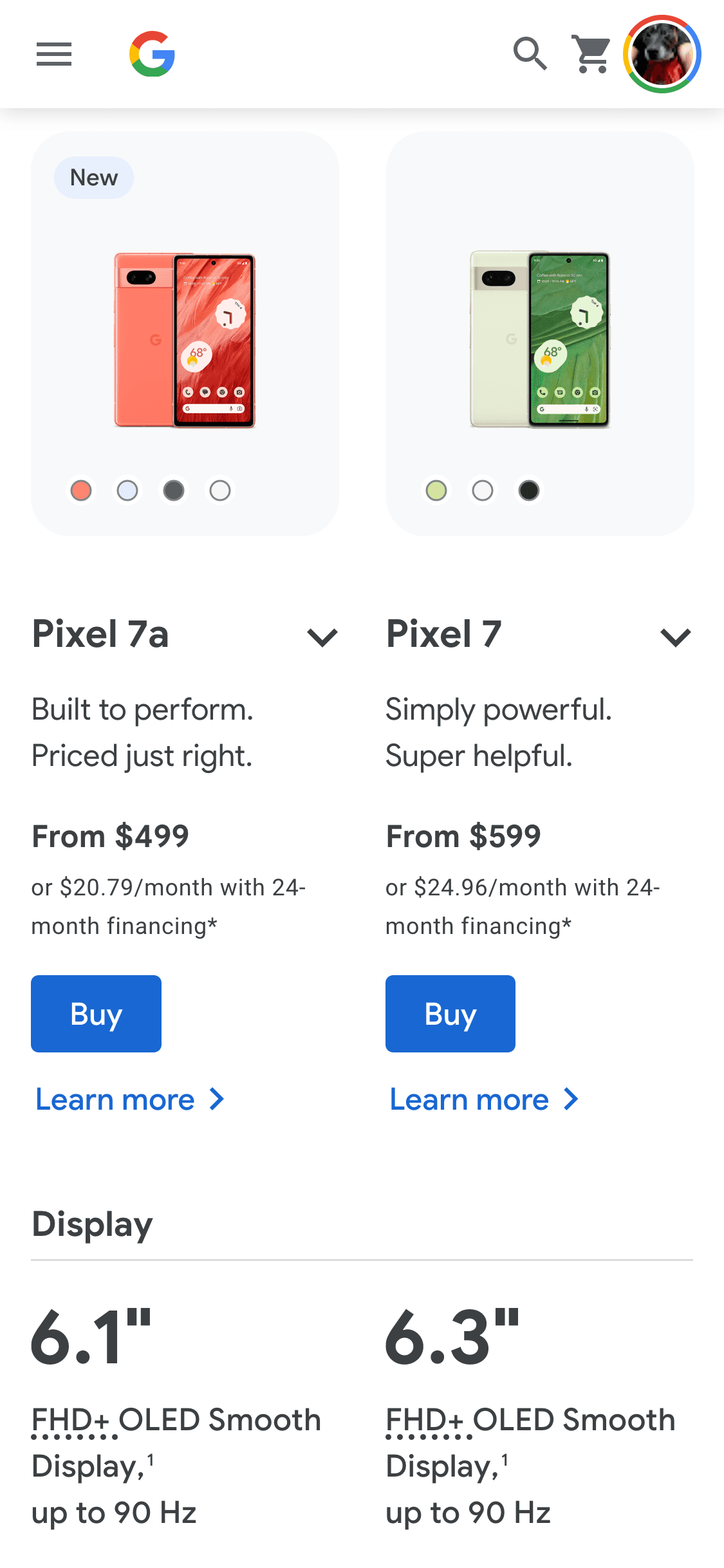
Competitors solutions
(store.google.com)
(apple.com)