Freshworks’ event pages. Designed twice, once for each brand.
These are the pages for Freshworks’ webinars and mid-size events. I took an agency’s design in the spring and made it a template teams could set up themselves. The brand changed that summer, so I designed it again on the new system.
It started as a wireframe.
An outside agency handed over a wireframe: title, sponsors, speakers, a switchback, an agenda, an FAQ and a form, stacked and centered.
The brief had two parts. Make it better, and make it something a marketer could set up without a designer.
One page, eight setups.
Every event page carries its product’s color and has to work light or dark. I built the template with switches: pick the product, pick the mode, and the hero, the panels and the buttons follow.
Handed over that spring.
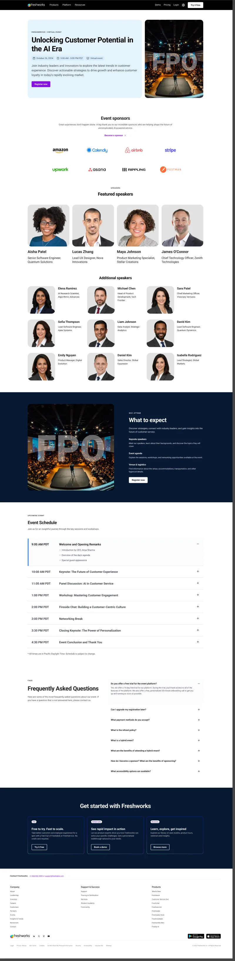
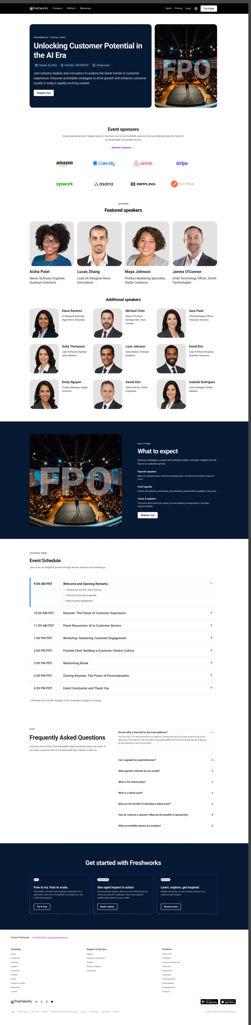
Then the brand changed.
Weeks after the handover, Freshworks redesigned its web brand and design system: a serif for headings, warm neutrals instead of product blue, new components.
The template was built on the old one, so it waited until the new system settled.
- FebruaryBack at FreshworksRejoined the web team.
- March to AprilRound oneThe handover becomes a template with product and mode switches.
- June to JulyThe rebrandNew type, new color, new components. The template no longer fits.
- August to SeptemberRound twoThe page redrawn on the new system.
The page, reordered.
Against eight event pages from other companies, ours put sponsors and two speaker grids ahead of the first reason to attend. Round two puts the reason first.
A black hero, the details card beside the headline, a facts row with the run time, and an agenda that leads each row with the outcome.
Five states, from save the date to on demand, so it’s never stale the morning after.
One template, every product.
The hue is the product’s: blue for employee experience, green for customer experience, purple for AI, pink for Freshworks itself. Dark mode means the hero, not the page. The page stays paper; the hero switches.
An in-person event adds a venue and photographs. Nothing else moves.
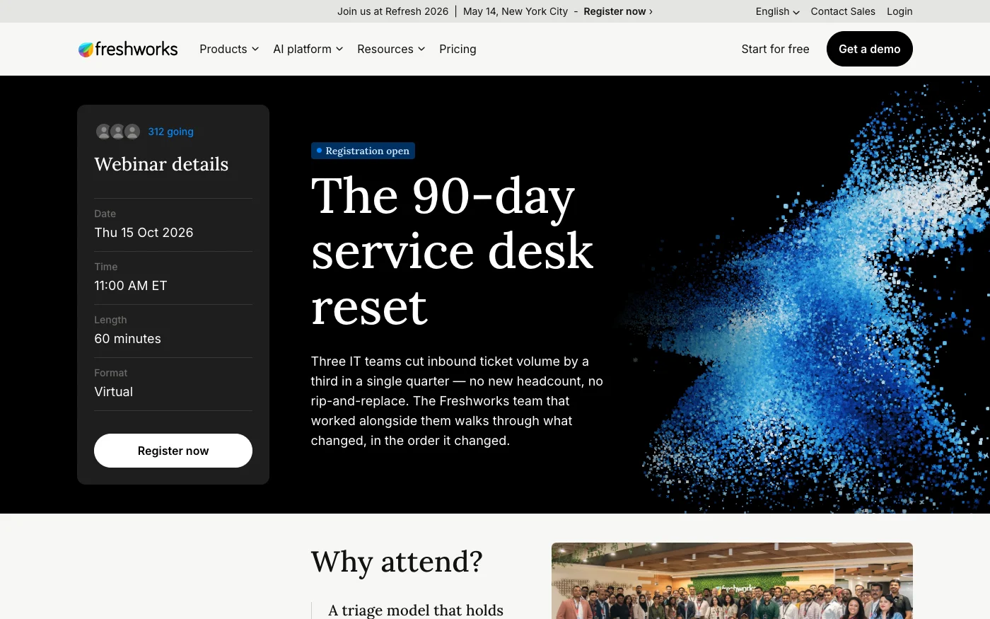
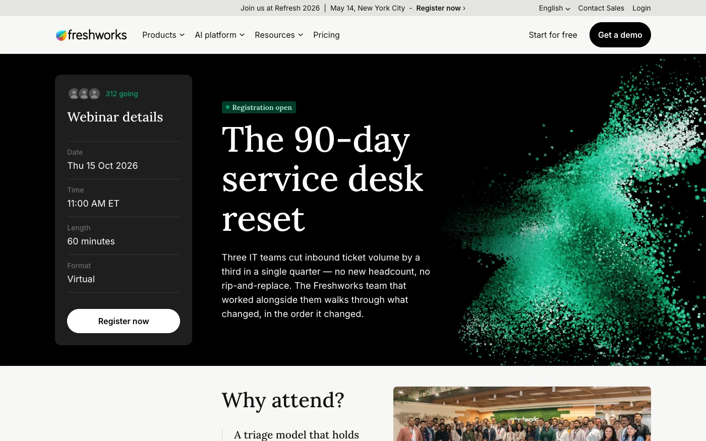
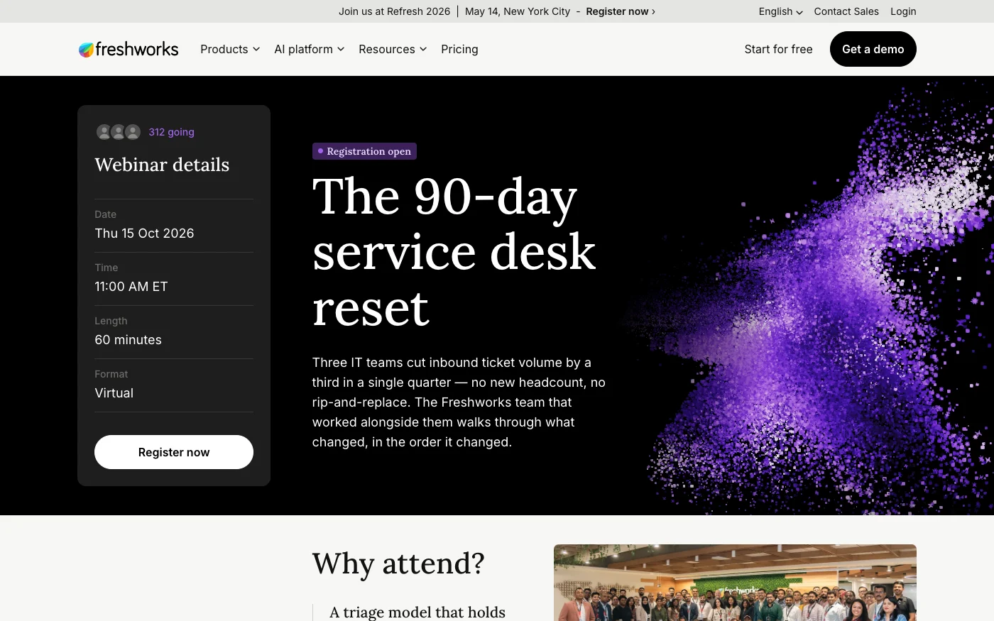
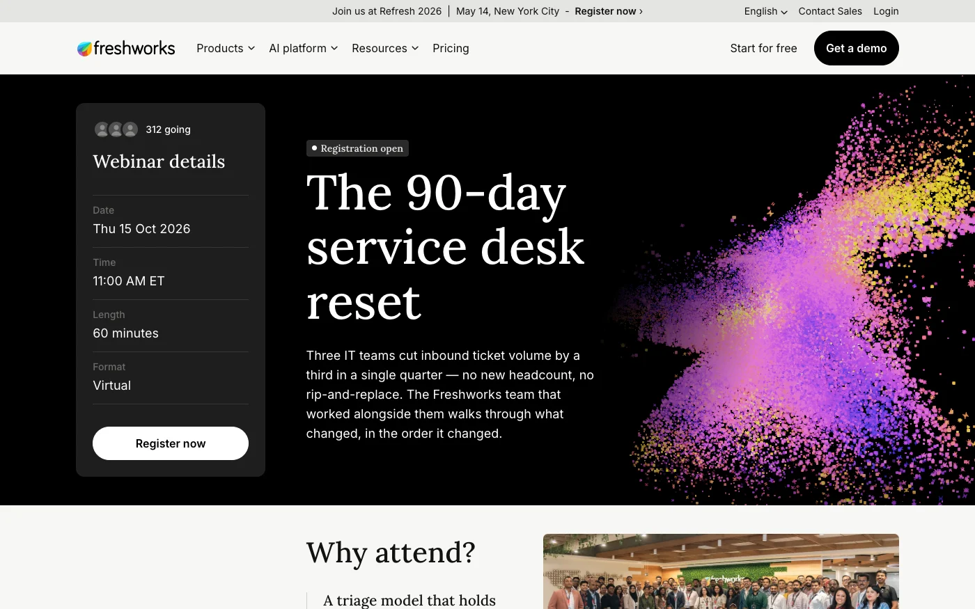
The hero isn’t a video.
It’s a live flock in the product’s color, built in my own murmuration tool, that answers the cursor and the scroll. Every event page uses the same one.