300+ components, from XD to Figma. AT&T Business’s design system, rebuilt for a team new to Figma.
AT&T Business’s design system lived in Adobe XD, with no responsive behavior and no guidance on using it. I rebuilt it in Figma as three libraries, with a guide for the designers building with it.
300+styles & components
3libraries
37documented pages
One foundation, two platforms.
Wireline and marketing pages were built on one platform, and wireless on another. So the system became a shared foundation with a component library for each.
Every value comes with a rule for using it.
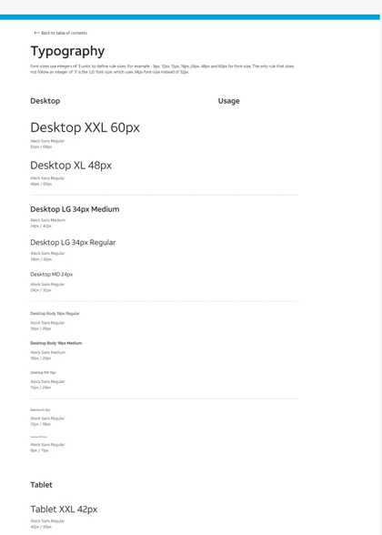
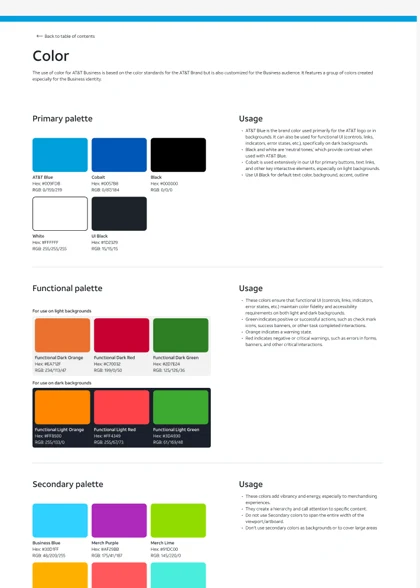
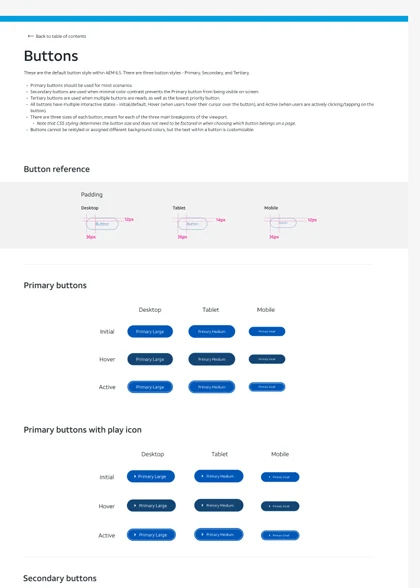
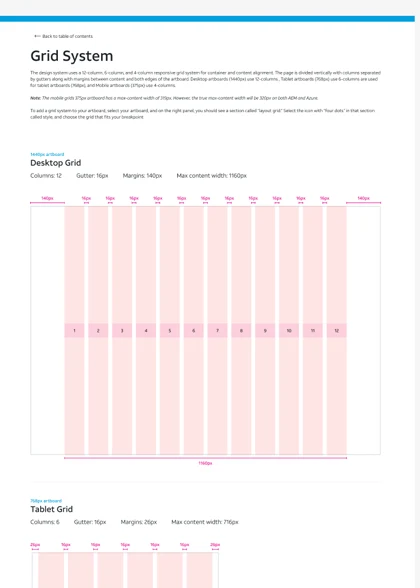
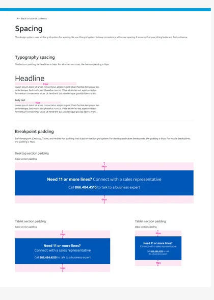
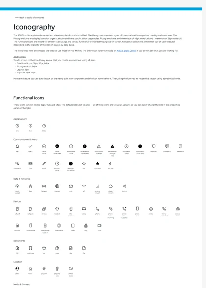
Type, color, grid, spacing, icons and buttons each got a page that says when to use a value, not just what it is.
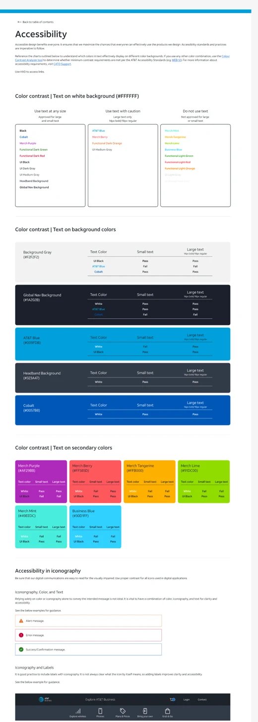
Contrast decided before anyone opens a file.
Every brand color is rated against every background it can sit on, for small and large text. Designers pick from a list instead of running a checker.
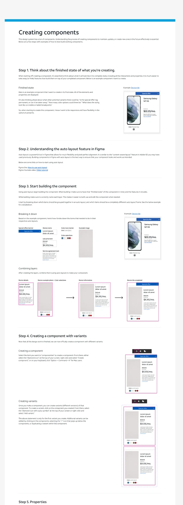
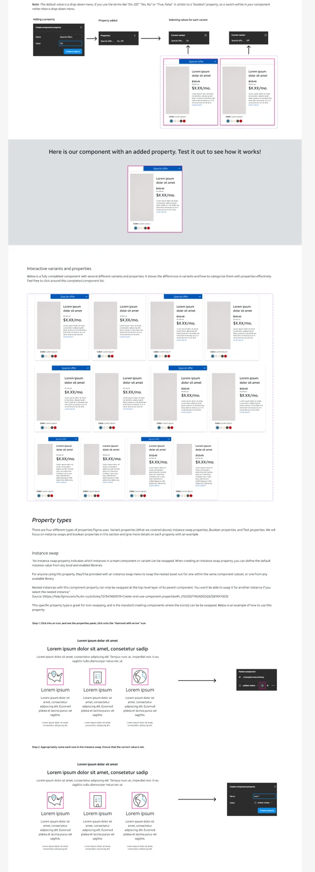
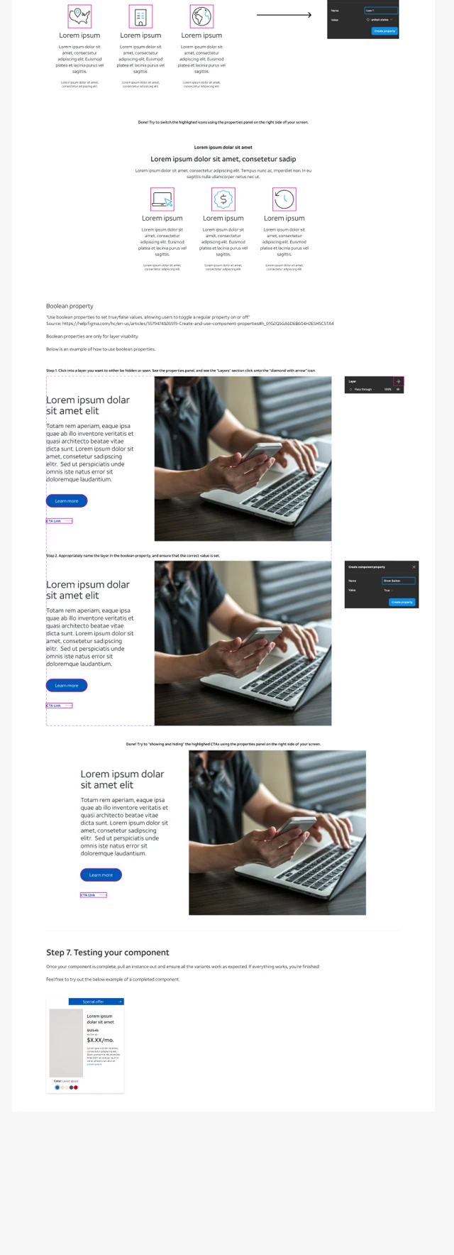
A guide built inside Figma, for designers new to it.
Much of the team hadn’t used Figma. The guide builds a component in seven steps, with live components you can edit on the page that teaches you.
Our content writers went into Figma too, to change copy. So I built components that take longer or shorter copy without a designer fixing the layout, and wrote the writers a short guide to editing copy without breaking anything.
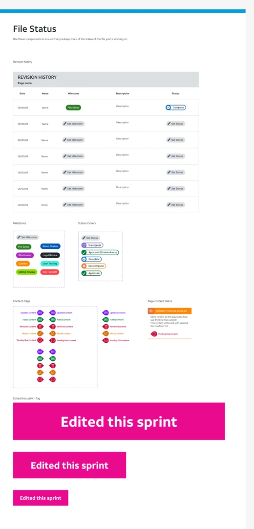
Every page says what changed this sprint.
Revision history, status stickers and an “Edited this sprint” tag keep the file current for everyone working in it.
Published, and filled in from live pages.
Five designers, me included, and our content writers worked from it. Figma was the source of truth for the whole business site: layout and copy changed there first, then went to developers.
We audited live pages for components teams used but the system lacked, and built them in.
One was the mobile plan comparison table, which turned into its own project.
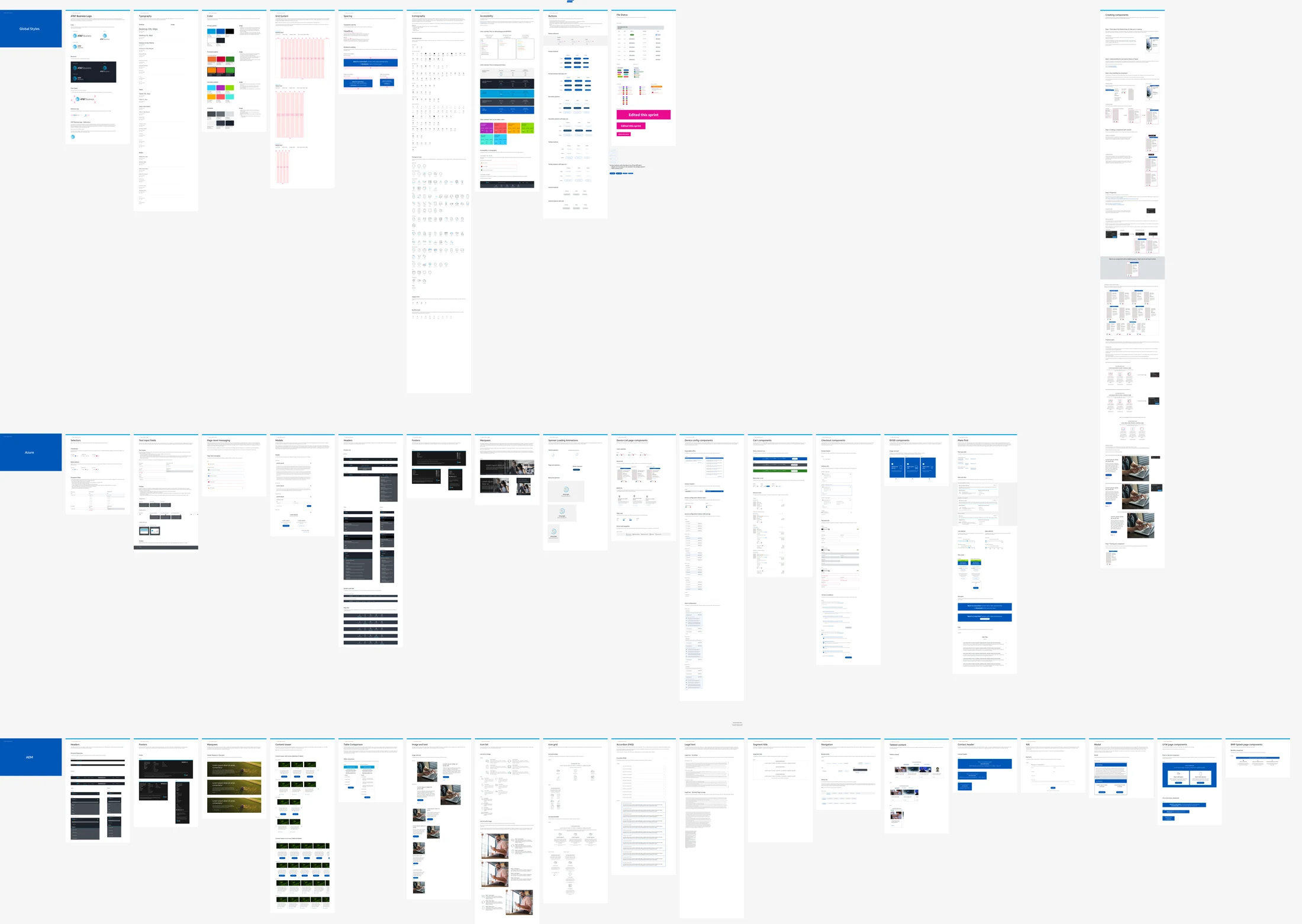
300+styles & components, published across three libraries