QA in an hour, not a day or two. Brightspeed Business’s design system, rebuilt with a spec sheet for every component.
Brightspeed Business already had a design system when I joined the account, and QA kept catching the same misses. I asked the developers what would help, then took the system over, rebuilt its foundations, cleaned up every component, and gave each one a spec sheet they could build from and check against.
52color primitives
75tokens
48text styles
QA kept catching the same four things.
Spacing, font sizes, component details and how things behaved. Every QA round meant going through the build, screenshotting what was off and writing up what the spec said. That took a day or two, and the back and forth went on after it.
The specs existed. They just weren’t all in one place.
Rebuilt from the tokens up.
The dev team was newer and still learning how to build some of these patterns, so every QA round took a lot of my time. I asked the lead developer what would get the team up to speed. His answer was one source of truth, somewhere I could point them to.
I’d been leaning that way already. Hearing it from inside the dev team settled it. It would make their job easier, and mine.
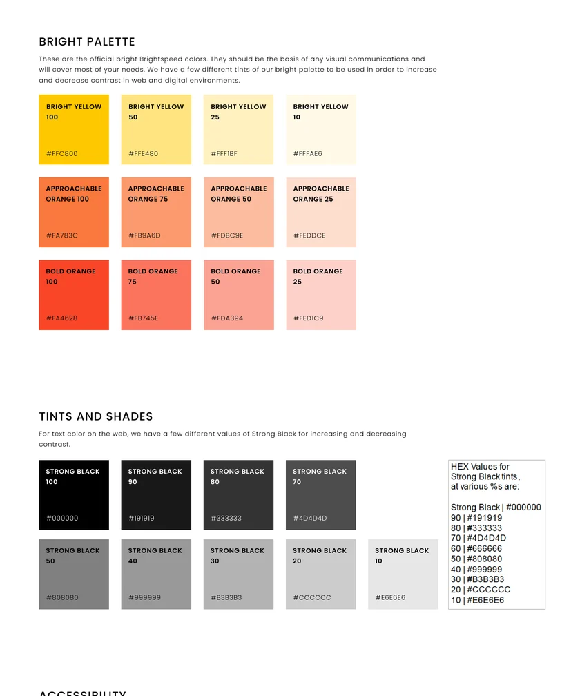
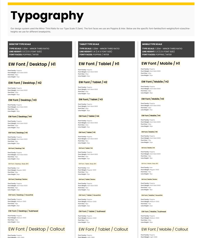
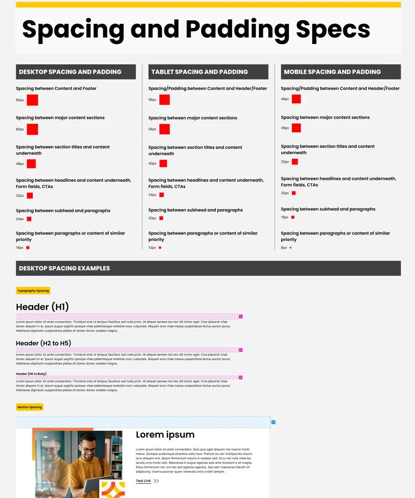
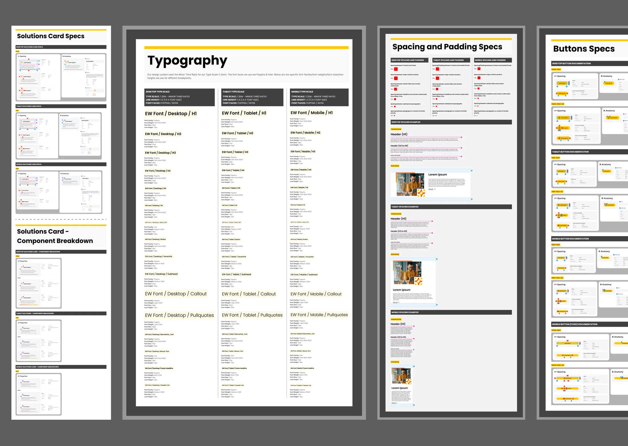
I took the system over and rebuilt its foundations: the color primitives, the tokens that point to them, and a type scale and spacing rules for desktop, tablet and mobile.
Then I went through the components themselves. Some weren’t built on the spacing system, some used the wrong text styles, and some didn’t respond to screen size at all. I rebuilt each one so it lined up, stayed clean and worked at every breakpoint.
52 primitives, 75 tokens and 48 text styles, under about 30 pages of components.
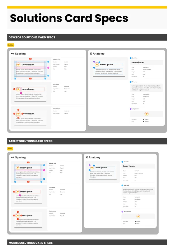
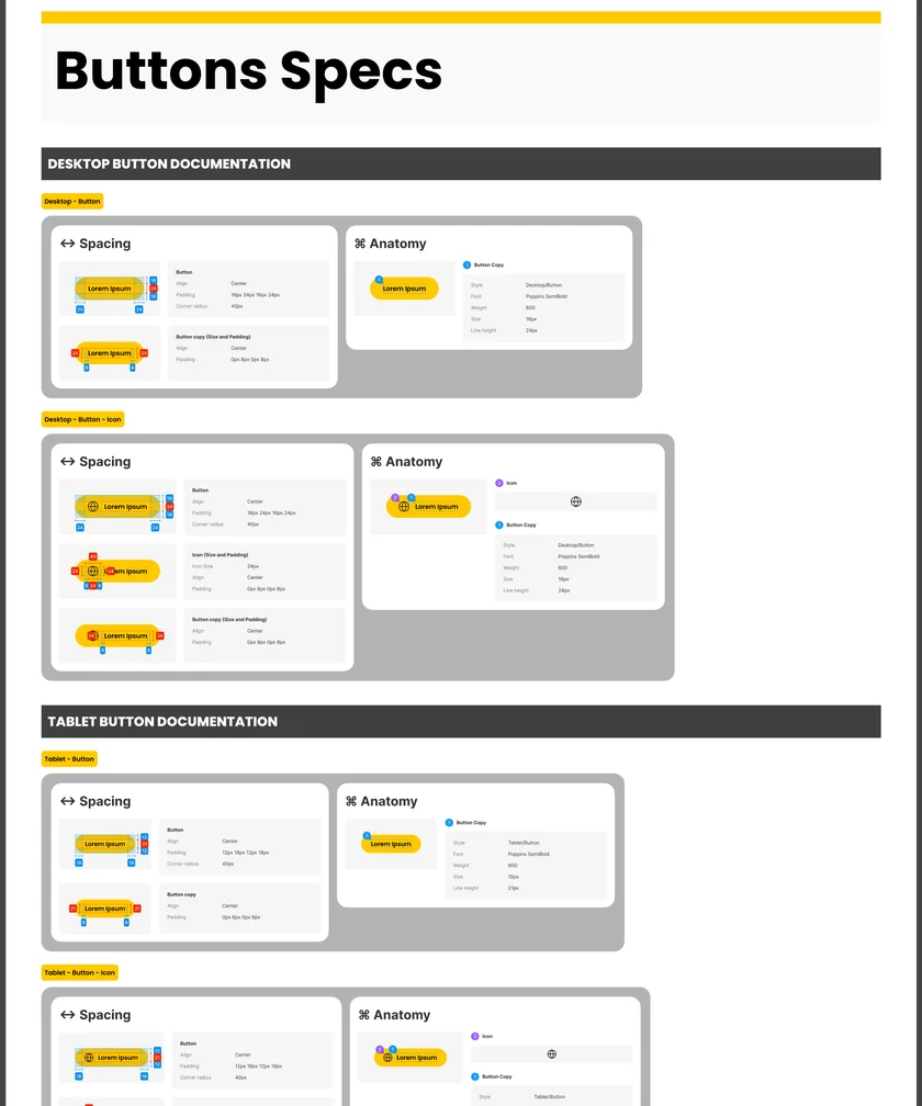
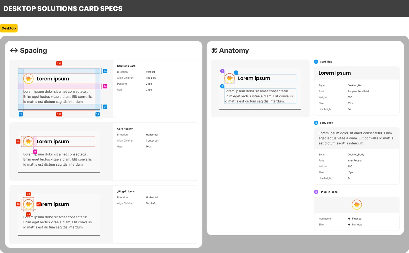
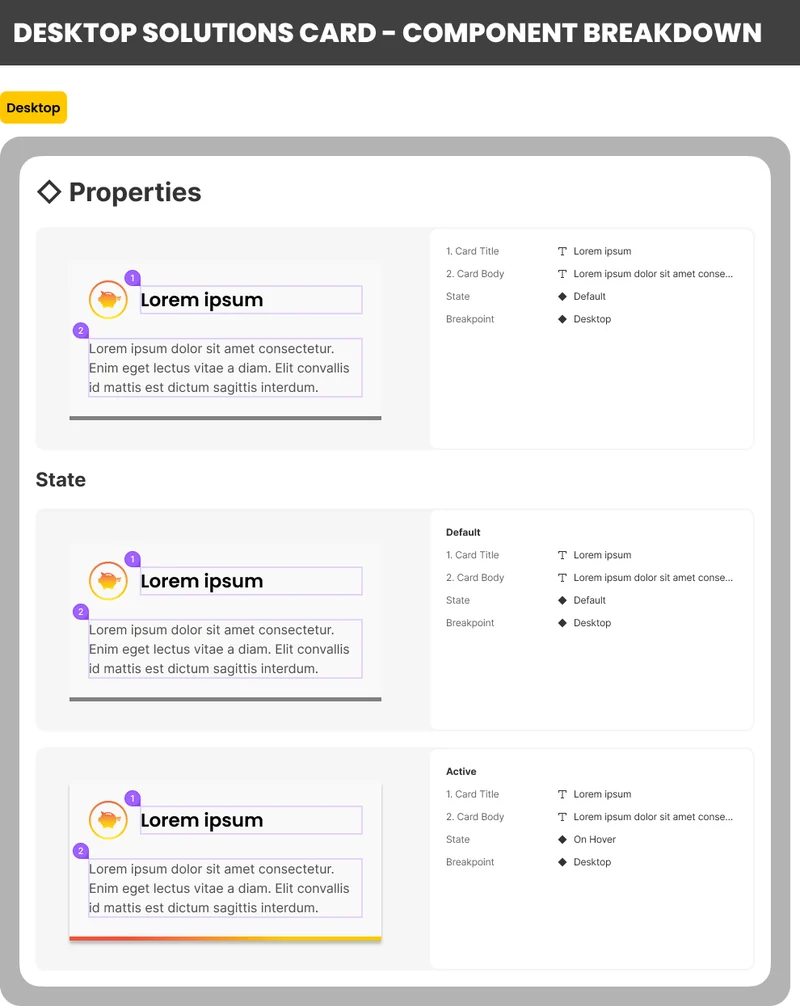
Every component comes with a spec sheet.
Each sheet answers the four misses before anyone asks, at desktop, tablet and mobile: padding and gaps in pixels, the text style on every line, and every state the component can be in.
Everything a developer needs to build it, in one place.
In QA, a link instead of a screenshot.
Once the system rolled out, developers built from it. When something was off in QA, I pointed them to the page that covered it instead of writing it up from scratch.
Faster builds, fewer rounds.
With every spec in one place, developers built faster, and there were far fewer rounds of back and forth after QA.
I can’t say for sure how much of it reached the live site. What changed was how the team worked.
1 hrof my time per QA at most, down from a day or two